U.S. Air
Force Data
Dashboard
A mission-critical platform redesign: dual-theme interface, precision data visualization, and enterprise accessibility for government operations.
Bringing clarity to complexity, one dashboard at a time.
This UX case study delves into the journey of creating a user-friendly dashboard for the U.S. Air Force, focusing on enhancing the user experience by introducing a meticulously crafted color palette, distinct dark and light themes, and data visualization elements.
This project aimed to streamline data access and improve the overall usability of the dashboard, building a product that enhances internal team management and tracks vendor orders across multiple channels, while adhering to the highest standards of security and usability in the government sector.
Goal
PrimaryInternal Team Management
Build a product that enhances internal team management and tracks vendor orders across multiple channels while adhering to the highest standards of security and usability in the government sector.
SecondaryAccessibility & Usability
Deliver a dashboard that any U.S. Air Force personnel can use effectively , regardless of their technical background or specific operational needs , while maintaining military-grade visual standards.
Challenge
The U.S. Air Force sought a solution that would make their data more accessible, visually appealing, and user-centric. Three core tensions defined the problem space.
Complex Data
The dashboard needed to handle a vast amount of data from various sources while maintaining absolute clarity. Information density had to be high without sacrificing legibility.
User Accessibility
Ensuring that all users, including those with accessibility needs, could effectively interact with the dashboard , from screen reader compatibility to keyboard-first navigation.
Visual Consistency
Balancing the visual appeal of the dashboard with the need for a professional, military-grade aesthetic across both dark and light operating environments.
Process
Color Palette Generation
Understanding Brand Identity
To maintain the U.S. Air Force's visual identity, I conducted research to understand their brand colors and design guidelines , mapping existing usage patterns against accessibility benchmarks.
Crafting the Palette
A harmonious color palette was developed that blended the existing brand colors with additional shades complementing the military theme. This palette ensured information hierarchy and visual consistency across all screen states.
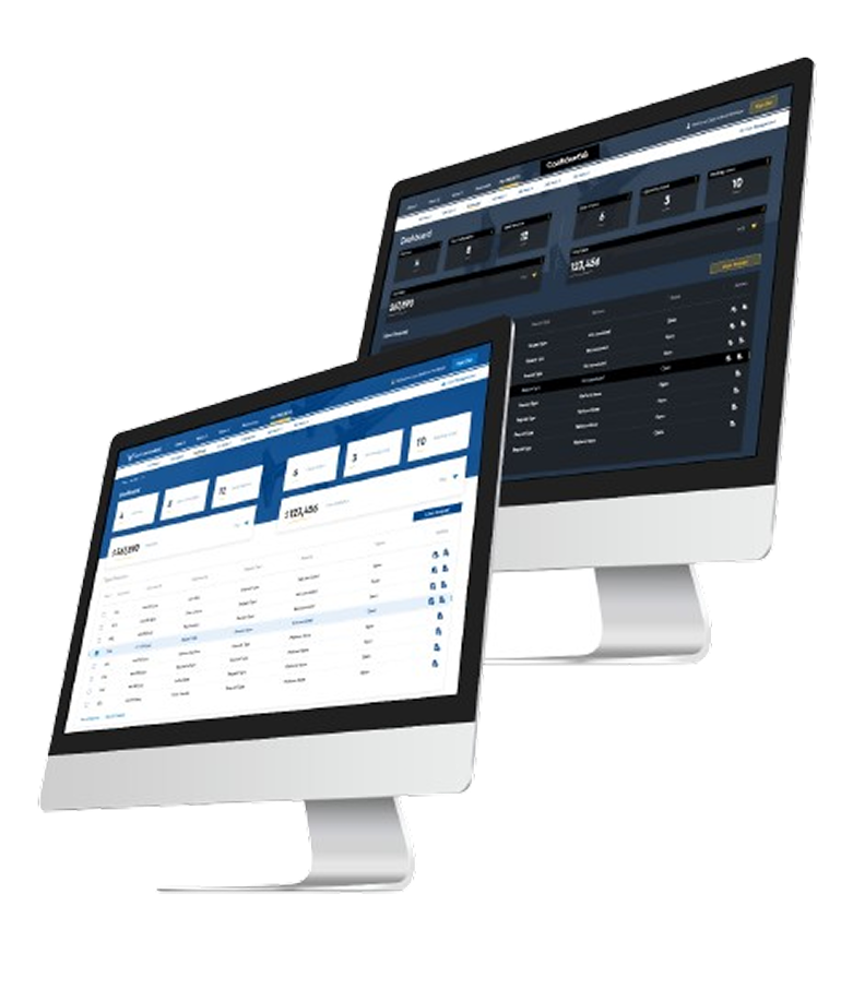
Dark & Light Themes
Dark Theme
Recognizing the need for both day and night use, I designed a dark theme that reduced eye strain during nighttime operations , using calibrated luminance ratios to maintain contrast while reducing fatigue.
Light Theme
The light theme provided optimal visibility in well-lit environments, catering to different operational scenarios. Both themes share a unified component system, ensuring zero inconsistency across modes.
Dashboard Design
User-Centered Layout
The dashboard layout was designed with a focus on user needs, placing critical information within easy reach , critical metrics above the fold, secondary data accessible in one action.
Data Visualization
Incorporating charts and graphs to make complex data comprehensible at a glance , each chart type chosen specifically for the data relationship it represents, never for decoration.
Custom Widgets
Custom widgets tailored to the specific needs of the U.S. Air Force, enabling quick access to mission-critical information without navigating away from the primary view.
Accessibility
Ensuring the dashboard met WCAG 2.1 AA accessibility standards, including features for screen readers, keyboard navigation, and focus management throughout every interaction.
The Platform in Detail

The Results
The redesigned Air Force dashboard delivered measurable improvements across usability, data comprehension, and brand alignment , enabling personnel to work faster and with greater confidence.
Improved Usability
The introduction of distinct dark and light themes ensured optimal usability in various lighting conditions , from hangar floors to control rooms , reducing operator errors significantly.
Enhanced Data Comprehension
Data visualization elements enabled personnel to interpret complex information rapidly, facilitating faster and more confident decision-making at every command level.
Brand Consistency
The carefully crafted color palette maintained brand consistency while enhancing the dashboard's visual appeal , balancing military-grade aesthetics with modern usability principles.
Accessibility Standards Met
The dashboard's adherence to WCAG 2.1 AA accessibility standards ensured it could be used by a wide range of individuals , including those relying on assistive technologies.