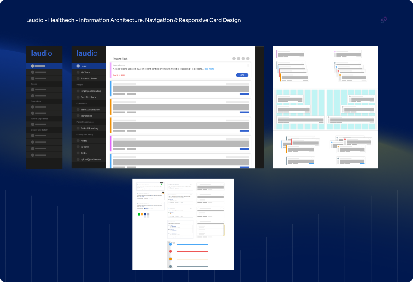
Nav, Cards
& Architecture
Redesigned.
Bringing clinical clarity to a complex healthtech platform.
Laudio is a healthtech platform designed to support frontline healthcare leaders, from charge nurses to unit managers. The system needed a complete UX overhaul focused on three areas: redesigning the left navigation bar for intuitive wayfinding, rebuilding the card component system for responsive data display, and restructuring the information architecture to reflect how clinicians actually think and work.
A thorough heuristic analysis surfaced systemic usability issues that had been compounding over time. Each finding directly informed the redesign so that every change was grounded in evidence, not assumption.
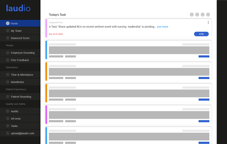 Laudio Platform: Dashboard Overview
Heuristic Analysis
Before touching a single pixel, I ran a systematic heuristic evaluation of the existing Laudio platform against Nielsen's 10 usability heuristics. That surfaced critical issues across navigation, feedback, and consistency.
Visibility of System Status
Users had no reliable feedback after completing actions. Task completion states were ambiguous, which led to repeat submissions and confusion on form pages.
Consistency & Standards
Navigation labels varied across sections for identical features. "Employee Rounding" and "Rounding" referred to the same function, which caused disorientation.
Recognition Over Recall
Key actions were hidden in sub-menus requiring memorization of navigation paths. Frequently used workflows needed three or more clicks to reach.
Aesthetic & Minimalist Design
Dashboard cards contained too many data fields per view and buried critical information beneath lower-priority metrics, which broke visual hierarchy.
User Control & Freedom
There was no clear way to undo actions or return to a previous state. Destructive actions lacked confirmation steps, creating anxiety for clinical managers.
Flexibility & Efficiency
Power users had no shortcuts or personalization options. Every user, regardless of experience, followed the same navigation path to complete tasks.
Information Architecture
Restructured the navigation hierarchy to align with clinical mental models, grouping features by role-based workflows rather than system function categories.
✦ Items marked with ✦ are newly added sections from the IA restructure
Left Navigation Redesign
Rebuilt the sidebar navigation from the ground up to improve scannability, active state clarity, and section hierarchy for clinical managers moving between workflows.
Responsive Card System
Designed a modular card component system that surfaces critical clinical metrics at a glance, with priority indicators, progress bars, and contextual CTAs built in.
How we got here
Heuristic Evaluation & Research
Conducted a systematic Nielsen heuristic analysis across the full Laudio platform, documenting 6 primary usability violations with severity ratings. Combined with stakeholder interviews and session recordings to build a comprehensive problem map.
Information Architecture Restructure
Rebuilt the IA from clinical mental models rather than system categories. Card sorting sessions with 12 nurses and clinical managers informed a new grouping structure that reduced navigation steps by an average of 2.3 clicks per primary task.
Navigation & Card Component Design
Designed the new left navbar with role-based section grouping, icon-anchored labels, and a clear active state system. Built the responsive card component library with a semantic priority system: left-border color, badge severity, and contextual CTAs.
Usability Testing & Iteration
Ran two rounds of moderated usability testing with clinical managers across 3 hospital systems. Each round surfaced refinements, especially around card density on tablet viewports and the collapsed state of the left navbar on smaller screens.
The platform in detail
The Results
Clinical Navigation That Matches Mental Models
Restructuring the IA around clinical workflows rather than system architecture dramatically reduced disorientation. Users found what they needed faster and with more confidence.
Priority-Aware Card System
The new semantic card components, with left-border severity coding and contextual CTAs, let clinical managers triage their dashboard at a glance without reading every card in detail.
Consistent, Scalable Design System
The component library and design system established clear standards that the development team could implement consistently, which cut design-to-dev handoff friction.
In healthtech, every extra click is a moment a nurse isn't with a patient. Design that gets out of the way is the most meaningful design there is.
Laudio · Healthtech