Planara
Axsium Group
Transforming a powerful enterprise workforce planning platform into an intuitive, conversion-ready product experience.
Axsium: Workforce Management
Axsium Group is a renowned workforce management consulting firm offering solutions designed to optimize labor operations for businesses worldwide. Their flagship product, Planara, is an advanced workforce planning, scheduling, and forecasting solution.
The primary objective was to create an intuitive, engaging product experience for Planara that effectively showcases its features, benefits, and value proposition, balancing technical depth with accessibility for both decision-makers and technical users.
Visit Planara ↗Scenario Planning & Analytics
Restructured Planara's core planning views around clarity: progressive disclosure keeps complexity behind clean, role-appropriate entry points.


Complex features,
diverse audiences
The key challenge was to distill Planara's complex feature set into an easily digestible format without losing the technical depth that appeals to power users. The platform had to speak simultaneously to HR professionals, operations managers, and C-suite executives, each with fundamentally different information needs.
Beyond messaging, the interface itself was cognitively demanding. Users dropped off not because the product lacked power, but because it lacked clarity.
Structured.
Scalable. Clear.
Staffing & Metric Management
Redesigned configuration flows reduce onboarding friction; operators can manage staffing levels and metric templates without needing technical support.


The success of the Planara redesign demonstrates the value of user-centered design, especially in the context of complex B2B enterprise software.
Metamatn Design Team · Case Study Summary
Multi-Screen Context
Rendered across browser and desktop environments to demonstrate the product experience at full fidelity.
.png)
.png)
.png)
Measurable impact
from day one
The newly designed Planara product experience significantly increased user engagement and drove measurable growth in lead generation for Axsium Group. The platform's intuitive information architecture and role-specific messaging helped potential clients immediately understand Planara's value, leading to higher conversion rates and reinforcing Axsium's position as a leader in global workforce management.
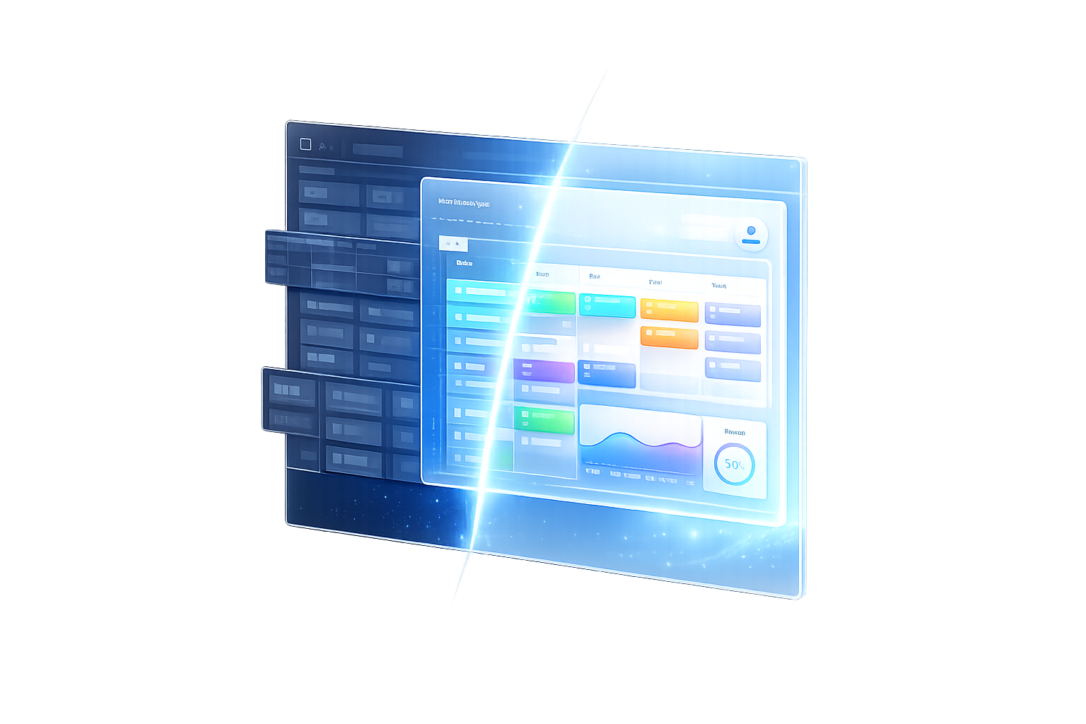
Dashboard · Default State
The full-page dashboard redesign gives users immediate situational awareness: key metrics, scenario status, and actions are all visible above the fold.
